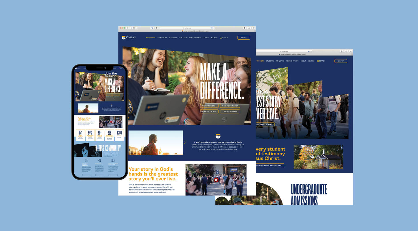

FEATURED CASE STUDY
CORBAN UNIVERSITY BRAND REPOSITIONING
CLIENT:
CORBAN UNIVERSITY
SCOPE:
STRATEGY / BRAND MESSAGING / VISUAL BRAND DEVELOPMENT / ENVIRONMENTAL GRAPHICS / WEBSITE DESIGN
Refinement of the strategic brand message and visual identity to highlight the university’s Christian foundations while adding energy to its marketing.
The Need
We submitted an RFP for Corban University in Salem, Oregon, in 2023 and were thrilled to win the work. Corban needed a refreshed messaging and visual brand that would help them stand out in the PNW while highlighting their identity as a Christian university.
The Goals
The goals for Corban were straightforward: refine the university’s messaging based on discovery and strategy, and elevate the visual brand language to highlight the university’s unique personality while adding energy and distinction.
The Solution
At its core, Corban is an eclectically Christian university that challenges students to "make a difference" for Christ. Our messaging aims to adds definition around that. The visual solution uses bold color, dynamic shapes, and typography to highlight the campus’s beauty and the uniqueness of its students and faculty.
The Takeaway
Each university is unique in its own way. The best strategy taps into the recipe that makes the it distinct. While each ingredient may not be entirely ownable, the recipe always is. Once you've tapped in, let the visual language serve as a conduit.

Brand Position
Corban University provides an environment where students are surrounded by other Christians who guide, challenge and support them academically and spiritually so that they graduate with character, a solid faith and the confidence to impact the world for Christ.

Brand Message Pillars
COMPASSIONATE | DIRECT | INSPIRATIONAL


Color
Typography
HEADLINES & CALLOUTS
SUBHEADS & CALLOUTS
BODY COPY
FORMAL OCCASIONS

Photography Tone

Duotone Imagery
Iconography
Organic Image Frames


Corban U. Wordmark


Additional Work


