


FEATURED CASE STUDY
CEDARVILLE THEOLOGICAL SEMINARY BRAND DEVELOPMENT
CLIENT:
CEDARVILLE UNIVERSITY
SCOPE:
BRAND IDENTITY / BRAND STRATEGY / BRAND MESSAGING / VISUAL BRAND LANGUAGE
The creation of a brand identity, brand strategy, key messaging and overall visual brand language for the newly created seminary.
The Need
Cedarville University had been exploring the creation of an official seminary for some time, and this year, they decided to bring that vision to life. The new seminary needed a distinct identity that aligned with the broader Cedarville brand while establishing an expression uniquely its own. Our role was to create a brand that honored the university's legacy while clearly communicating the seminary's unique mission, purpose, and commitment to preparing students for faithful ministry.
The Goals
Unlike a typical sub-brand, the seminary needed to establish a stronger sense of independence while remaining unmistakably connected to Cedarville University. Our challenge was to leverage the equity and recognition of the Cedarville brand while creating a distinct identity that positioned the seminary as more than an academic offering. It needed to communicate a clear, focused path for students pursuing a lifelong calling to ministry, grounded in rigorous biblical education and faithful preparation for the work ahead.
The Solution
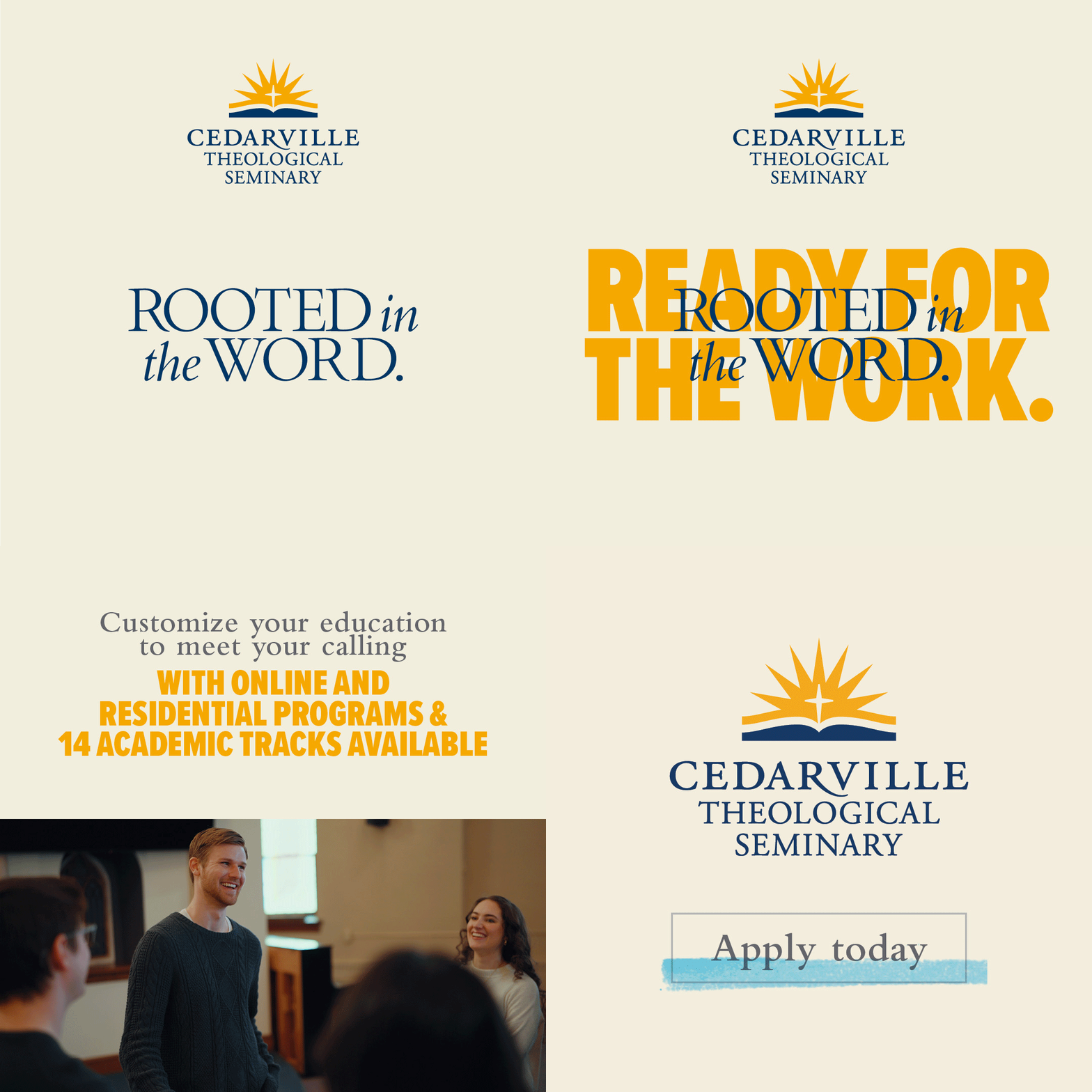
Through discovery, we learned that, like every program at Cedarville, the seminary is rooted in deep study of Scripture with the ultimate goal of preparing students to faithfully serve the local church and their future ministries. From that insight came the core brand message: "Rooted in the Word. Ready for the Work." The identity leverages the open Bible element from the Cedarville logo to reinforce this emphasis on Scripture while establishing a distinct expression. Visually, the brand is bold and academically driven, balancing the depth of the Word with the calling to put it into practice.
The Takeaway
When launching a new offering at your university, the temptation is often to create something entirely distinct that can stand on its own. However, it's equally important to recognize the equity and credibility that already exist at the institutional level and identify the brand elements that can be leveraged to strengthen the new identity. It's a delicate balance to strike, and we believe the Cedarville Theological Seminary brand successfully threads that needle—honoring the university's legacy while establishing a clear, compelling identity of its own.


CEDARVILLE THEOLOGICAL SEMINARY POSITIONING STATEMENT
Pursue God’s call to ministry through a seminary that stands for biblical authority, academic excellence, and vibrant community—all built on the proven credibility of Cedarville University. With a focus on serving and advancing the local church, you will be prepared to serve Christ’s church with conviction, humility, and joy.
CEDARVILLE THEOLOGICAL SEMINARY KEY COMPONENTS
THE WORD OF GOD
IN EVERYTHING
Our focus on scripture isn’t just a piece of our academic pathway, it encompasses all we do.
FACULTY THAT
EMBODY MINISTRY
Our faculty exemplify spiritual maturity and serious scholarship, active in local churches and missions, disciple others,
and model lives of obedience
for students.
SERVING THE
LOCAL CHURCH
Preparing students for ministry in the local church no matter where they are in the world.
STAY CONNECTED
WITH CU
Connection to campus, to a broad church and alumni network, to others preparing for ministry, & to godly faculty.
ACADEMICALLY ROBUST. PEOPLE FOCUSED.
We believe in scholarship and provide a robust academic experience so our students can be prepared to be servant scholars in ministry.
BRAND NARRATIVE
TAGLINE
The CTS tagline symbolizes dedication
to studying the word and applying it in ministry.

PRIMARY LOGO
ICON
WORDMARK


COLOR

TYPOGRAPHY
Headlines

Headlines, subhead text & callouts

Body copy, subheads,
& callouts
Body copy, subheads,
& callouts

PHOTOGRAPHY
LEARNING ENVIRONMENT
(THE WORD)
We believe that our learning environments are unique and capturing authentic interactions is vital to the CTS brand. These images share how we are in the Word.

MINISTRY/
OUTCOME
(THE WORK)
The work that our seminary students do is so important to the story of our seminary.
GRAPHIC ELEMENTS
TAGLINE LOCKUPS

POSTER TEXT TREATMENT

TEXT AS BACKGROUND TEXTURE
MARKER HIGHLIGHTS

Marker highlights reference the markups made in the bible as you take notes and highlight key pieces.






Additional Work


